%20Data%20Stories%20in%20Remix.jpg)
Several months into this pandemic, cities across the world have continued to show immense resourcefulness and creativity. To better support the emerging needs that they’re discovering as they navigate new challenges, our team at Remix has also been hustling to broaden the scope of data analysis that can be done in our platform.
We believe that data needs to be seen in its proper context to truly shine. Data in isolation can be distracting, confusing, or even misleading, whereas relevant, well-visualized data can illuminate previously hidden patterns and help you draw connections that you’d never have seen otherwise. Now that we’ve brought these additional, interactive datasets into Remix, you can layer the information onto your maps and network designs to better assess impacts and highlight trade-offs.
Here are the latest interactive datasets in Remix that we’re most excited to share:
Public health precautions quickly became a top priority for transit agencies at the start of the pandemic. One of the most critical safety protocols is ensuring social distancing on buses: under different circumstances, an articulated bus might aim for maximum capacity at 100 riders, but now, many agencies are striving for 20-40 (or sometimes fewer) passengers per bus.
Viewing passenger loads with ridership in Remix helps you pinpoint where the system is overloaded to keep riders and drivers safe.
You can now see interactive passenger load and ridership data in Remix. Both datasets can be viewed at the same time, which helps identify problematic corridors.
Miami-Dade’s transportation department used Remix to identify the transit network’s hotspots: areas with loads greater than capacity and historically high ridership. Being able to leverage both datasets to identify challenging spots allowed staff to quickly provide additional short-turn bus service along the constrained corridors.

Transportation departments across the country are wrestling with the uncertainty of school reopenings. Many states and school districts are opting out of in-classroom learning this month, but may reopen in the following months. For transit agencies that also provide school bus service, being prepared for a sudden reopening is critical.
Preparation requires proactiveness. You can use Remix to draft contingency plans in the event that schools reopen in the coming months.
Cities and transit agencies can now bring in data layers for school campuses and locations of student pick-up/drop-off points. When planning out routes in Remix, users can easily identify the number of schools within walking distance from bus stops, and those that are not.


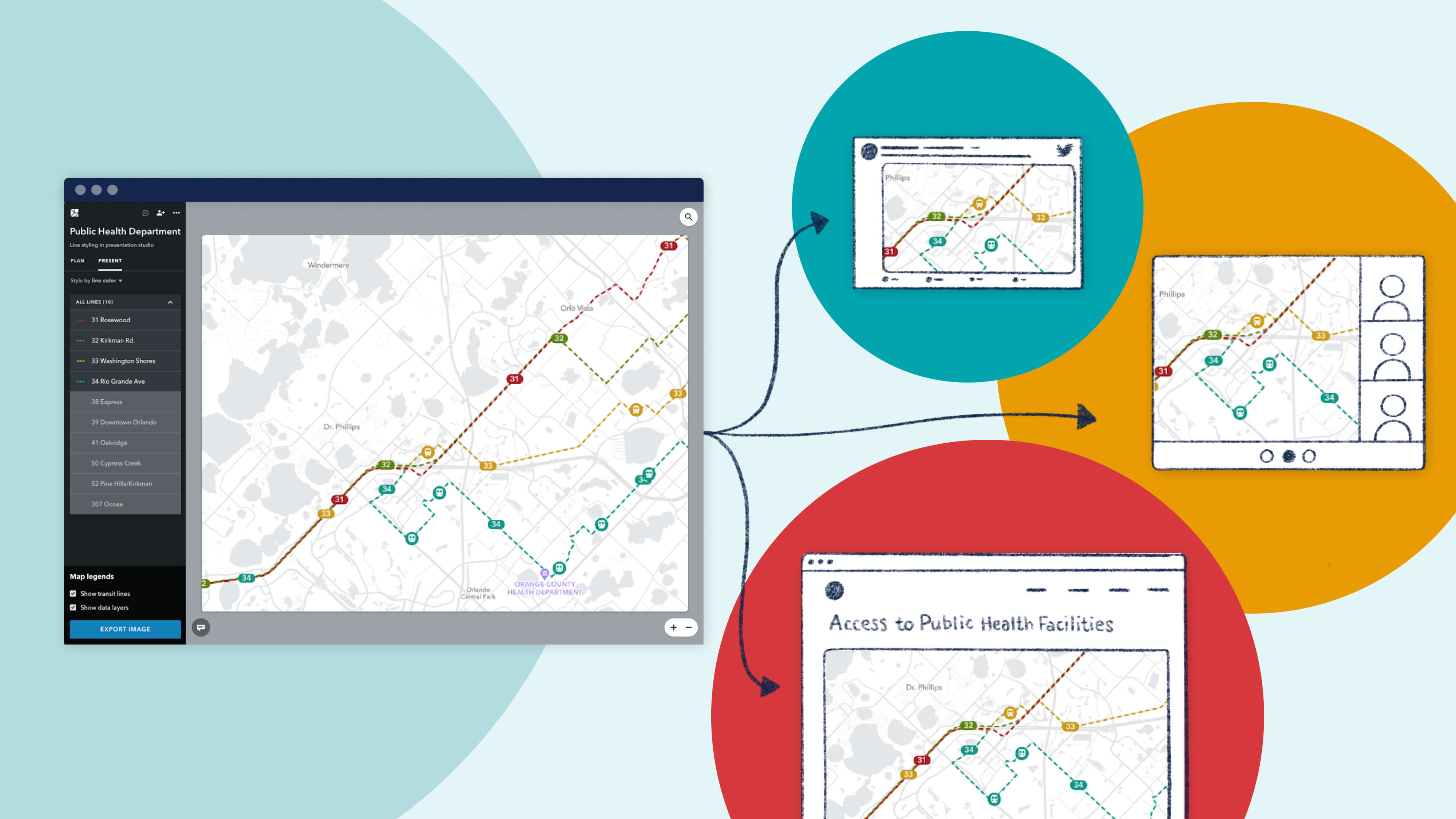
The need for capital improvement projects persists despite uncertainty in funding and budget shortfalls. More agencies and cities are relying on state and federal grant funding - making grant applications an increasingly competitive process.
You can craft a more compelling story with data analysis paired with easy-to-understand visuals.
Remix recently uploaded bus amenities data for Topeka Metro as they were writing an application for a grant from Kansas DOT. The planners with the agency identified challenged areas by overlaying their transit network with their “No Sidewalks” data and car-free household data.


They then identified opportunity areas with grocery store, ridership, and existing stops amenities data. The ability to overlay multiple datasets and filter down to high ridership spots with limited stop amenities provided insight into which corridor would benefit most from sidewalk infrastructure and other capital improvements.

The pandemic doesn’t mean that Vision Zero goals are on pause! Cities still need to evaluate safety data and track how they are doing against their Vision Zero goals to meet federal requirements on funding.
Collision data can be noisy and messy, but you can use Remix to make it easier to elevate hotspots for collisions and other insights.
Since collisions data can be visually overwhelming when plotted on a map, agencies need to be able to dynamically filter the dataset to pull the most pressing insights. Planners can identify areas of concern for the built environment when identifying corridors that have a high case of fatal collisions that happen in daylight.


COVID is pushing cities to quickly plan everything from pop-up bike lanes, temporary parklets, and transit recovery services to keep residents safe and moving. In some cases, traffic has returned to near-normal (Salt Lake City) or escalated (Wuhan), squeezing more people onto limited sidewalk space as they queue to buy groceries or move around their neighborhoods. Accelerating safe streets - also known as slow, healthy, or active streets - allows cities to move fast and spur behavioral change before traffic volumes resume to pre-COVID levels.
You can use Remix to quickly identify the demographic impact of network-level projects and fast track Quick Build or Slow Street projects.
In Seattle, when new cracks appeared along the West Seattle bridge, city staff were forced to close the bridge to traffic and find alternative routes for residents to get downtown. They chose Remix to plan scenarios for their extended bicycle network and quickly access rich transportation and demographic data to assess the community impact for the precise areas they were considering.

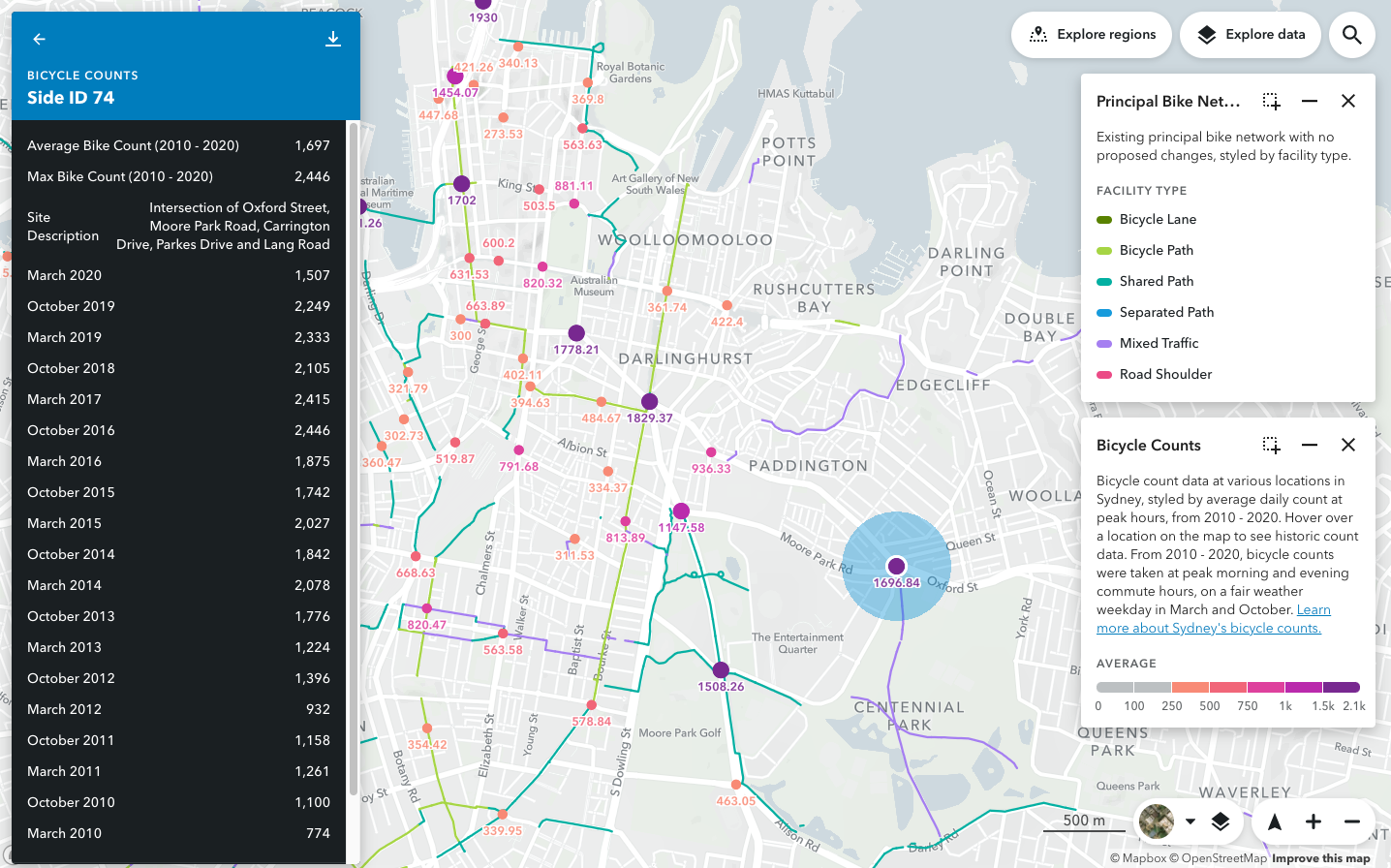
Count information is expensive to collect and is typically kept in static PDFs and spreadsheets for one-off analysis. But when this data is tied to geography and visualized on a map, it truly comes to life.
You can use Remix to bring count data into the context of the built environment.
Cities can identify areas with high volumes of bike traffic and focus on whether good bike infrastructure is accessible in those areas.
2020 is a big election year. Voter participation is foundational to our democracy and transit agencies across the US want to ensure that people can access polling places with their networks.
You can design a service plan with polling places on the map (a publicly available dataset through your board of elections). And, of course, given the extraordinary circumstance we are all in, everyone should be encouraged to vote-by-mail — and early, if possible!
Transit agencies can easily identify which polling places are walking distance to bus stops and gauge accessibility to all the available polling places.


Wow, look at that! You’ve made it to the end of the article. Now that you have, we’d love to hear what you are inspired to see in Remix. If you are a current Remix customer, please reach out to [email protected] or your Customer Success Managers. If not, we’d still love to hear from you! Drop a note at remix.com/demo.

Introducing On-demand Planning: The first planning product for on-demand and flexible fleets that is data-driven, integrated with the fixed-route network, and collaborative.

Meet New Remix, designed to be more intuitive, flexible, and more powerfully multimodal.
Since launching Presentation Studio, we’ve been delighted to see the creative ways in which our partner agencies are using the feature. We're proud to showcase their work with a "Map Gallery."

